”In a [alien tongue] ravaged by [plant tables] our only solace is [different colored tiles]”

Okay so for this week I finished up Alien02 by giving it a tongue.

Alien02-Tongue Head Alien02-Tongue Body

The tongue comes in two parts: the body and the head. The body is supposed to be stretched out while the head will just look menacing as it is extruded towards the player. There are barely any details on either the head or the body of the tongue simply because they need to be so small that details really does not fit on them. The head needed something to imply that it is dangerous, outside of coming out of the scariest enemy in the game, so I added teeth and horns to it. I say that but in reality this was done mainly due to the fact that the head began to look a little too phallic as I designed it. Now it just looks like a yellow version of the tongue from H.R. Giger’s Alien. The tongue is yellow because the group decided to color code various objects in the game. Health and everything related to it is green while energy is purple etc. Yellow became the code for danger and dangerous objects. That is why the projectiles for Alien01 are yellow. I made the two teeth and spikes cyan, simply because it was a complementary color to the tongue.

Plant Table - Green (Large) Plant Table - Blue (Large) Plant Table - Purple (Large) Plant Table - Rust (Large) Plant Table - Earth (Large)

Next up I made the design for the plant tables that are supposed to be implemented in the game. Early in the design process we came up with ideas for different sections of the ship that would be explored while playing through the game. One of the sections we came up with was the “greenhouse” area of the ship. It made sense that the crew of Icaros 1 would have a greenhouse, not only for generating a supply of oxygen for the crew itself; but for growing and studying alien plants as well. This would allow for some variation between the levels, showing the player that they are progressing forward as well as giving some personality to the level.  I played around with different colors for the leaves, trying to make them look more alien than the regular green ones and making others look like they would be in a state of decay. Not much thought was but into the design, really.

The game had previously been criticized for lacking color and we were suggested to paint the tiles with different colors to make it clear that the player was entering a new level, for example. I did my best to give the different tiles color and choosing colors that would work with the three levels after the first one. The greenhouse level was given green tiles, the living quarters got blue tiles and the map with the power generator was given a rusty red-brown-ish color.

tiles_128 (Dark Walls)version2 Tiles_Spritesheet_Blue Tiles_Spritesheet_Rust Tiles_Spritesheet_Green

No real difficulties or challenges while making these. The tiles were a bit time consuming but otherwise everything went smooth this week.

/Erik Ögren

Kill your darlings

So for this week I animated the death animation for Alien 02. The animation shows how the alien either melts, vanishes into thin air, or is simply vaporized by the player. We can also see how the alien’s metallic spine strains together, into what looks like a liquid ball of whatever material the spine is made out, and is violently split into four projectiles that are launched away from the remains of the alien.

When I looked at the blog post submitted my Markus Holm; about his work on the attack animations for the trees used in the game Green Warden as envisioned by Team 9, I was inspired by the effects he had created for two of the trees. Holm had visualized energy channeled by the trees and then used as an attack against the enemies for their game. If you want to see the animations and read about his work process I suggest you follow this link and take a look at his post:

https://markusholmgame.wordpress.com/2015/03/05/week-7-more-animating/comment-page-1/

I wanted to create a similar effect for the death animation of Alien 02 so I added a ring that would shrink at the center of the liquid ball, what is left of the alien’s spine, as if the ball would channel some sort of energy from its surroundings in order to launch the four projectiles. The colors of the rainbow was added to the ring in order to give it that flashy and energetic look I was looking for.

Alien02-Death

On a technical standpoint, what I did was to take a single frame from the idle animation and then lower the opacity of the body, teeth and eyes and raise the opacity of the spine. For the last time (as I’m writing this March 12th 2015) I had to strain the spine by moving all ten pieces closer to each other until they are liquefied into the metal ball, which I painted in separate layers. There really is not much else to the animation.

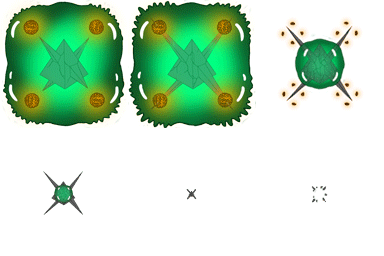
In all honesty I am a bit disappointed with the animation. The death animation for Alien 01 was a very creative piece of work for me, with unnecessary little personal flavor added to it, such as the spikes piercing the four balls inside the alien, shrinking with the pyramid only to explode after the slime has been absorbed by it. You can check out the animation here:

https://darethus.wordpress.com/2015/02/19/the-eighth-passenger-of-icaros-1/

I knew that Alien 02 had the potential of providing a more spectacular death, with crazier animations and flavor; with all the teeth, spikes, eyes, flesh or goo and the spine to play with. Would it explode? Implode? Both? Perhaps it would gouge its eyes out with its own teeth and proceed by swallowing itself as the spine would extend itself and pierce the sides of the alien as it opened a black whole and- you get the idea.

Sadly I knew that I would not have the time to realize Alien 02’s potential so it had to be reduced a change in opacity, with some effects added for the sake of flashy effects. I do not think I did a bad job by any means, just not the job I would have liked to do on my alien. But you do what you can with what you have, with the hope that you can improve and do better next time.

Look forward to more next week!

Open wide

This week I finished Alien 02’s primary attack animation.

The alien, unlike its predecessor, will not fire projectiles but will instead extrude its tongue in an attempt to latch on to the player character. The tongue will do damage over time and paralyze the player, making them unable to react; move or fire for a certain period of time. The tongue will also pull the player character towards the alien’s mouth and if the player character is close enough to the mouth it will start to do some serious damage to them.

Alien02-Idle+Attack

It is in the current state unclear how long the tongue will be, or rather; what range the alien will have. I would assume that it will be medium ranged – if close range is collision with hitbox and long range is the current firing range of the player and Alien 01. The idea of Alien 02 is not that it will be a huge threat in and of itself but rather a nuisance that forces the player to be consistently moving in an attempt to evade its tongue. Surely there are lots of ways to play around with the positioning of the two aliens as well as enemy composition. It will be interesting to see how our Level Designer chooses to expose the player to the extraterrestrial terrors, using enemy composition and level design effectively.

For all the animations I have done for this project, I have used Photoshop CC to animate the enemies. It has been… somewhat rough but it is certainly manageable. I have previously only used Flash CS5 for 2D animation and I can say that where Flash is smooth but illogical, Photoshop is rough but logical. Granted, Photoshop is not primarily developed for animation so it makes sense that it is not as smooth as something like Flash. There are two ways to animate in Photoshop CC, at least when it comes to the Timeline tool. You can either work in a – what would be perceived by most as a – timeline, or you can work in frames.

They both fulfill the same purpose but have different functions that work better or worse with different people in terms of preference. I find working in the timeline to be great for quickly sketching up a motion of a character or an object but I have not grasped it to the point where I know how to work in it while using layers. I know that you can add layers while inside the timeline and I’m sure you could extract the timeline into individual layers but I feel that I have more control when I work with frames. It might be because I have worked with Flash previously, I do not know.

I am punished for doing it though. If I switch between the frames, let us say I want to go from frame one all the way down to frame eight; the layers used in the first frame will be visible in every frame that comes after it. So I have to turn frame one’s layers invisible in every following frame. And then, when I have made sure that all layers correlates to their designated frames, if I want to go back to frame one I have to turn the layers from frame eight back to two invisible in all the frames they are not supposed to be visible in. I am convinced that there is not only a logical reason for this but a way or a function that makes this process much easier or removes this issue completely.

As for the animation itself it is basically just the idle animation with the fangs or jaws opening wider and the alien showing more gum. The spine tightens instead of its usual expansion and contraction, almost breathing motion. I also experimented with adding the blue pulse traveling through the spine, like some sort of electrical signal telling the alien to extrude the tongue and the player that the tongue is coming. The idea was to give some other visual feedback that the alien will extrude its tongue other than its fangs or jaws opening wider than usual. I do not yet know which version we will go with.

 Alien-02-Attack-Minimized     Alien-02-Attack-Minimized-(Spine-charge))

That is it for now. More to come next week!

/Erik Ögren

Boxes, computers and aliens – oh my!

A lot of nothing happened this last week in terms of work for the space shooter. I was supposed to create props for the game that would serve as guidelines for the visual style the other graphic artists in the group should be going for and looking back to whenever they would create props of their own. Embarassingly enough I only produced two props, basically. Firstly I began To design the basic design of a box to but in the game. The design of this box, with sharp lines and distinctive corners, would similar to the floor tiles function as a framework for the aesthetic various objects in the game should have.

 TheLastSignal-Box Medium (BLUE) TheLastSignal-Box Medium (GREEN) TheLastSignal-Box Medium (PURPLE) TheLastSignal-Box Medium (RED) TheLastSignal-Box Medium (YELLOW)

At first the saturation of the colors on the boxes were too high and because they all happened to be the same colors the game used for its color code (green for health/durability, purple for energy, yellow for danger etc.) I was worried that the player might be confused when they would not gain durability upon collision with the green box or take damage upon collision with the yellow one. I therefore decreased the saturation on the boxes, giving them a fainter hue. I wanted the boxes and containers on the ship to add color to the otherwise sterile white rooms and corridors but if players go out of their way to bump into the boxes expecting a service the box will not provide I might have to make further changes to the colors.

The other prop I made was a computer, an object the player will encounter throughout the game – mostly for unlocking doors or trigger events.

TheLastSignal-Props-Computer-(Minimized)

I used the same texture and colors as I had used when I made ‘H.A.C’ (Handheld Artificial Companion) for the game’s User Interface; which is just two metal bars opening and closing, with a blue hologram screen just like the computer.

After a couple of days worth of wasting valuable time I had to pull myself together for this weeks sprint. I was assigned the job of making the second enemy the player will encounter in the game. The new alien is unable to duplicate itself but compensates for it by being able to extrude its tongue in an attempt to ensnare the the player character. If the player character is ensnared the alien will start to pull them in and eat them if they come close enough to the mouth. When the player is in range of the mouth they will take damage. The tongue will also damage the player over time if they are ensnared.

Alien02---Idle

While I said in my previous post that I did not want the first alien to have any visible mouth, teeth or claws that would make it look like something the player would associate with animals that would not be capable of cell division, this alien clearly oversteps my previous boundaries. The reason for this is mostly because it had to look different than its predecessor as well as conveying its core funktion – that being able to eat the player and extrudeing its tongue to catch them. This alien is more violent and should look the part.

The longest time I spent on this animation was when I was trying to decide it’s color scheme. I used a spring green base color for the body and used complementary colors for the details but I thought it looked too much like the first alien. They are not supposed to be the same or look too similar to each other. I played around with the color balance tool in photoshop to try and add more tones of red and blue. The alien still has its green body but also looks different enoigh, in terms of color, not to be cunfused with its cousin. The two fangs should be enough for the player to tell the difference, but you never know.

More to come in the future!

/Erik Ögren

The eighth passenger of Icaros 1

Going from white, sterile spaceship interiors to slimy (probably unhygienic) alien stowaways; I was put in charge of designing and animating the first enemy the player will encounter in the game. The original concept document already had completed enemy designs but the group found them to be more adorable than terrifying, which did not really match the tone we were going for. One of the main aesthetics of the game is the dark and haunting atmosphere of being aboard a ship flooded with hostile alien life.

The first alien the player will encounter is able to fire projectiles in the direction of the last occupied space of the player character. The alien also has the ability to multiply; creating an identical clone of itself. It can move across the empty space inside the ship to hunt the player if they are within range for the alien to be aware of them. With these features in mind I looked for ideas in creatures that inhabit earth with similar abilities.
The closest thing I was able to find was prehistorical, single-cellular organisms that would multiply and create a larger organism over time.
Even though I reasoned that the alien had to be strange and foreign the idea of giant single-cellular aliens sounded sounded good. I wanted to avoid creating disgusting aliens with lots of teeth, claws, tentacles and other disturbing features because because all those listed examples are only scary because we are biologically programmed to associate them with danger. What is truly scary are things we do not know or understand and it does make sense that alien life would not necessarily resemble life as we know it. A creature without a mouth to house teeth or limbs to have claws would by this logic be more scary than generic bug or carnivorous mouths.
The result of my thought process was a ball of slime. This design was pretty generic as well so to add more unnatural elements to the alien I put a rotating metallic pyramid in the middle of it, the tip facing the front of the alien and the base facing the back. The solid and pointy pyramid would clash with the soft and fluid organic slime which was just what I wanted.

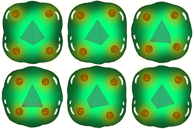
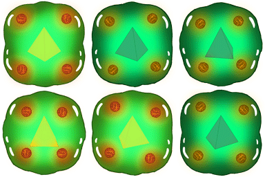
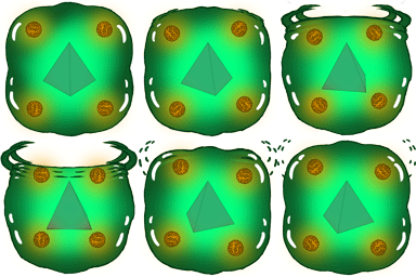
The following gifs are the four different states of the first finished designed alien.

Idle:
Alien01-Idle

Multiply:

Alien01-Multiplication

Attack:

Alien01-Attack

Death:

Alien01-Death

The motion was not difficult to achieve per se, but it was more time consuming than I would have thought. Most difficulties arose from the fact that Photoshop is not primarily an animation program. There lots of bugs and lack of functions animation programs like Flash would (not) have. For every minor change to the key frame I had to go back and redo the animation until only the specific images for the key frames were visible when they needed to be visible.

I am happy with the results though. For all the hardship I had to endure this was way more fun that building tiles for the spaceship. Look forward to more updates!

/Erik Ögren

Building a Spaceship With Tiles

Four weeks ago me and the rest of Team 5 started the development of the space shooter ”The Last Signal”, originally designed by Team 10.

For this project I chose to take the role of Lead Artist, along with the responsibility of producing and shaping the visual tone of the game. A Level Designer was also chosen in the group, with the assignment to design and build the different level maps in the game. In order to decrease the workload of the Level Designer the group decided that the Lead Artist should make tiles that could be combined to make every room or corridor the levels would require. Everyone agreed that this was a simpler and more time-saving method than should the Lead Artist or any other graphic artist spend time to build every map from scratch. It would also remove the risk of clashing different art styles when building the levels of the spaceship. Everyone uses the same tiles. Granted, some of the levels will need to look different to add variety to the levels and introduce different parts of the ship. The engine room would not look the same as the living quarters or the greenhouse, for example.

The ship is a science vessel on a mission in outer space so it made sense that its interior would be clean and sterile white, just like the uniforms of the people inhabiting it. The interior might appear empty and boring but that matches the mood of the majority of the ship. Most of the variety and color will come from the various props, stored in the different rooms and corridors, not from the rooms and corridors themselves. Most of the ship will not even be visible during the first part of the game as the energy is out and the ship will be covered in darkness, only sparsely lit by only a few stationary red floodlights, guiding the player through the level(s).

I knew from the beginning that the most challenging part of creating these tiles would be to make them compatible with each other, no matter how they would be assembled. I sketched out a room that would be able to be constructed with approximately four tiles to see how a smaller room on the ship would look.

TLS-Tiles-First Sketch

 From there I made two tiles showing the upper part of the room to test different textures for the tiles.

TLS-Tiles-Texture Sketch 01TLS-Tiles-Texture Sketch 02I realized that the textures were clashing too much from tile to tile so I tried to soften up the edges of the tiles to better hide the fact that they were two separate parts of the same ship. More tiles were soon added to the roster: Entrances and exits, walls facing north, south, east and west; each with extensions to make either an entrance or a wall longer if necessary. The process of making tiles was far more time-consuming than I had anticipated at first. Not that the pattern or texture was difficult to reshape for the different tiles, but because I had decided to add a metal mesh texture to the sub floor I had made my work harder than it needed to be.

Most of the work process consisted of aligning the mesh lines to link seamlessly with one another. Even though it made my work harder I felt that the metal mesh lines needed to be in the level. The lines are meant to guide the player through the ship aside from the stationary lights and the player avatar’s own flashlight. There is a reason for the split entrance/exit lines to be different from the standard single wall lines. Not only does it add variety in the pattern but the separation and reunion on the lines are meant to symbolize the joining of two separate rooms in the same interconnected infrastructure of the spaceship, represented by the single mesh line.

So this is what the final result looks like. This is a sprite sheet for the existing tiles.TheLastSignalTiles-Spritesheet kopiera

More updates to come!

/Erik Ögren